AZ Turnhout
Specialised care close to home.
Client
AZ Turnhout
Services
Graphic design, Print
Designing patient-centered care
AZ Turnhout is a regional hospital offering specialised care close to home. The hospital consists of two campuses in Turnhout and is part of ZNK (Ziekenhuisnetwerk Kempen). Brandle designed two patient brochures for AZ Turnhout, lays out the employee magazine and took care of various new logo designs.
A new welcome brochure
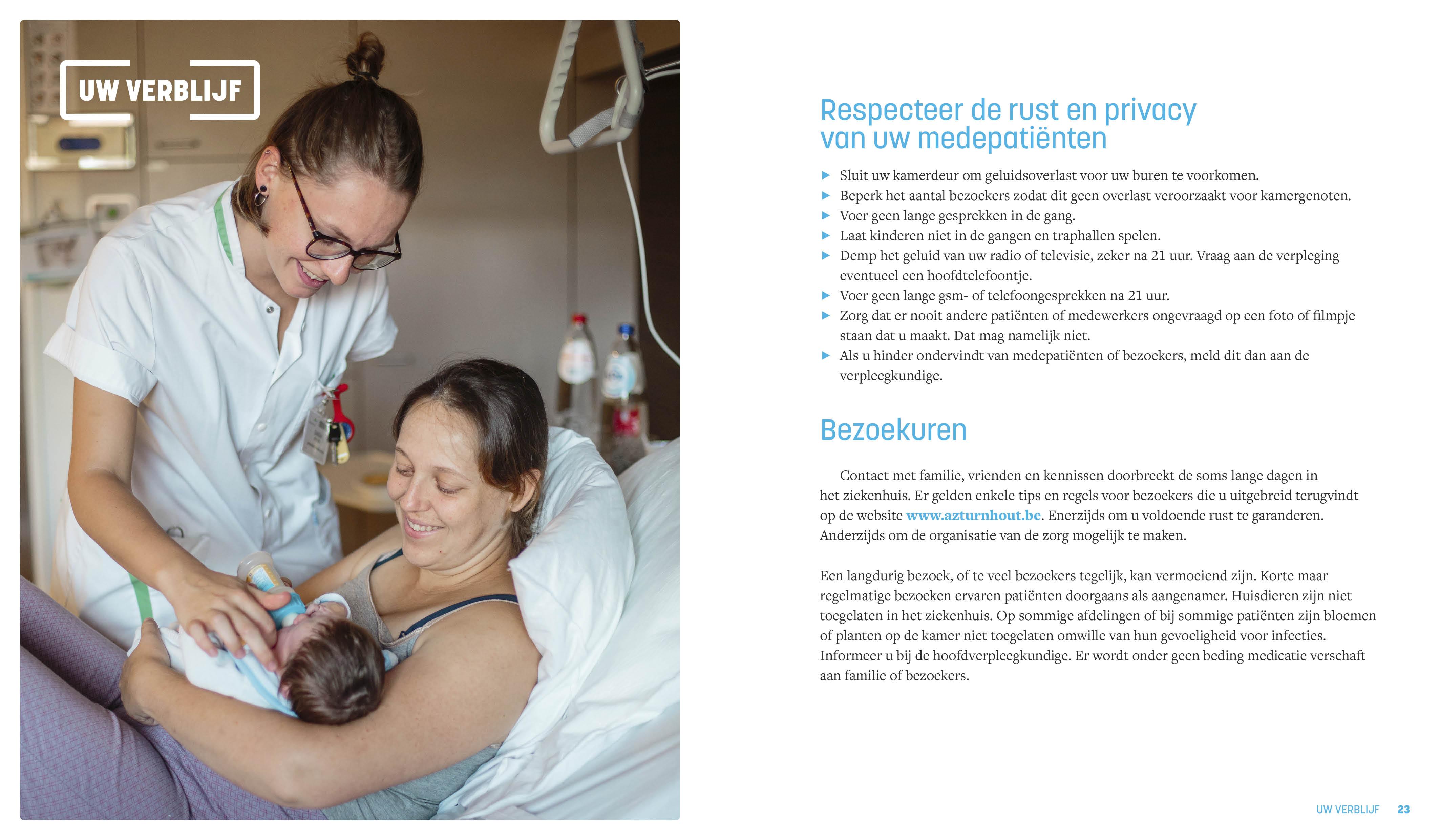
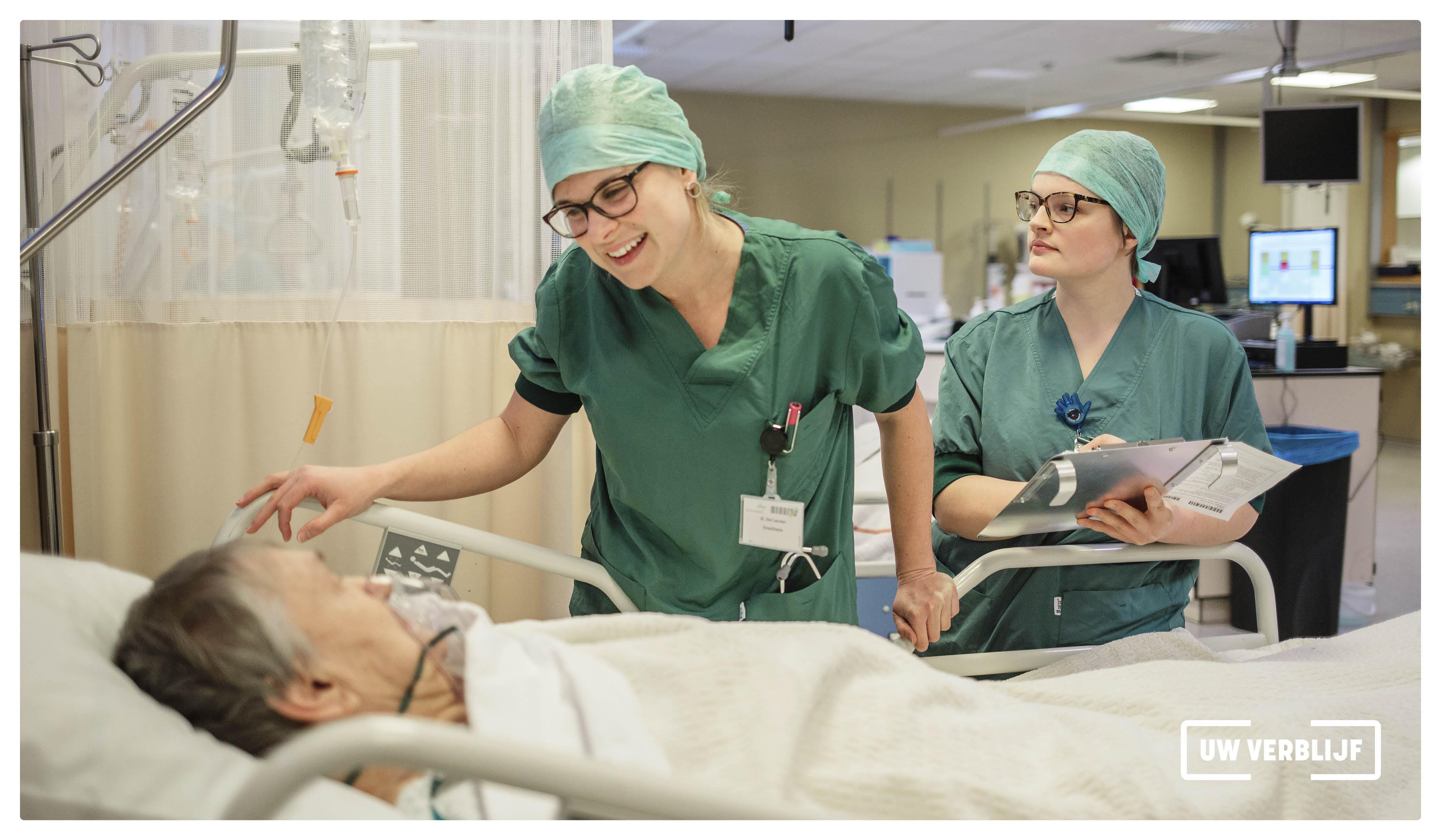
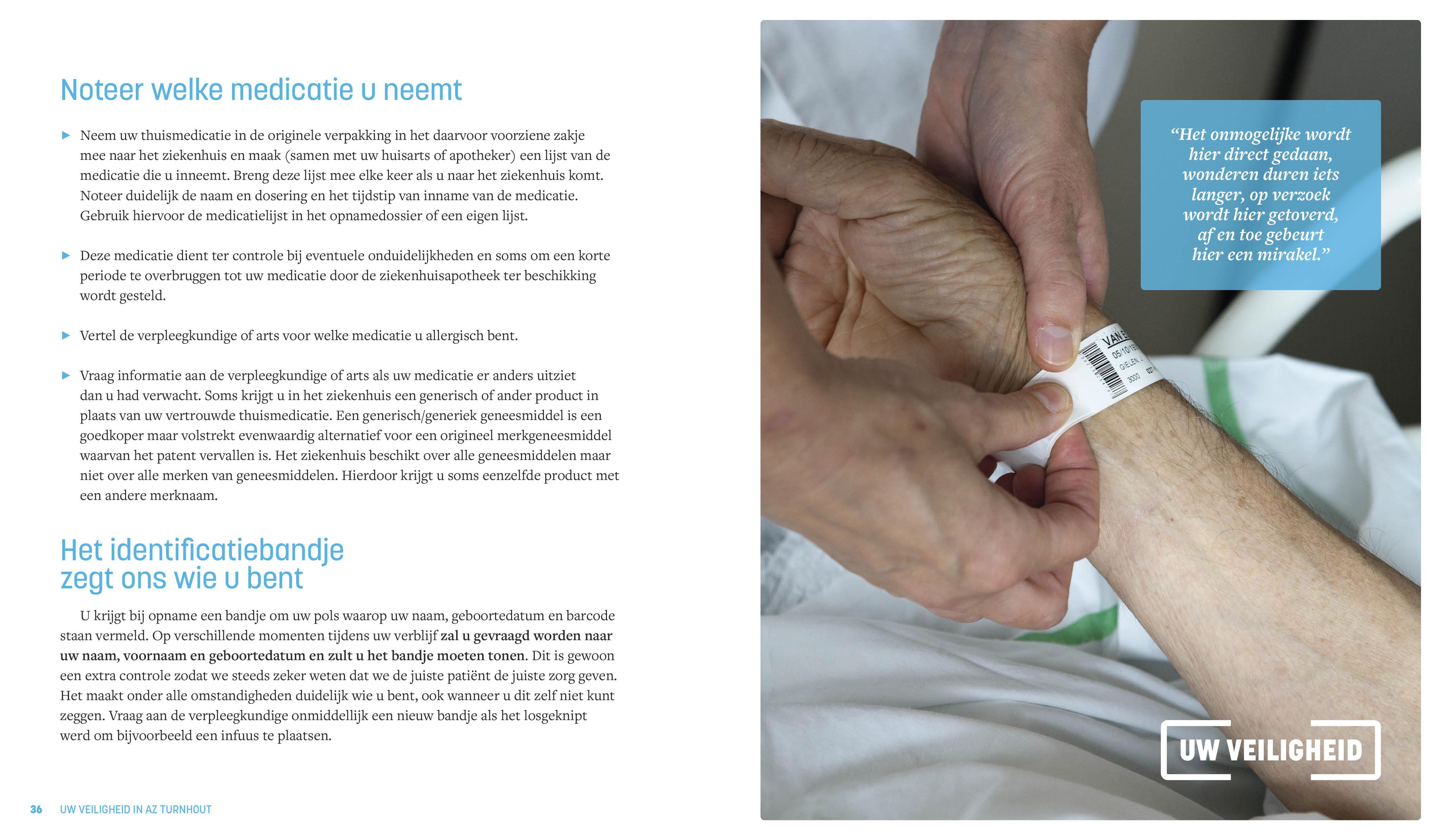
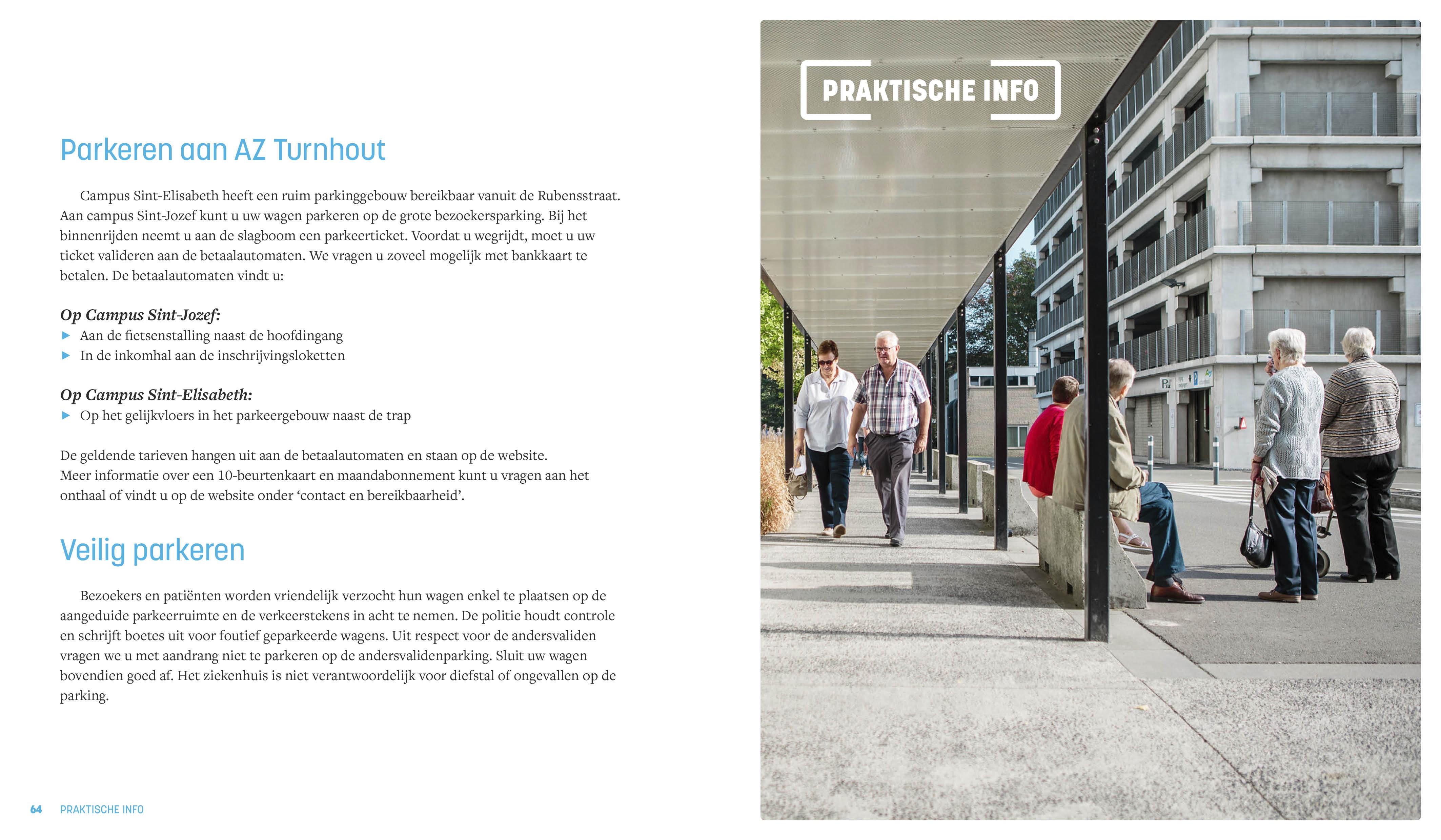
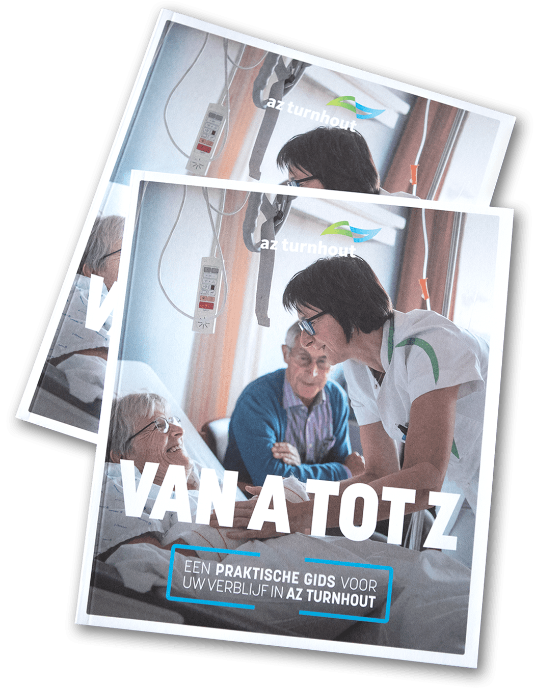
AZ Turnhout asked us to overhaul the existing welcome brochure. We created an accessible guide that reassures the patient and provides him with useful information. The accessible design and the well-written text enhance the nice feeling that you’re welcome and that you’re receiving the best possible care.
Fresh corporate colours
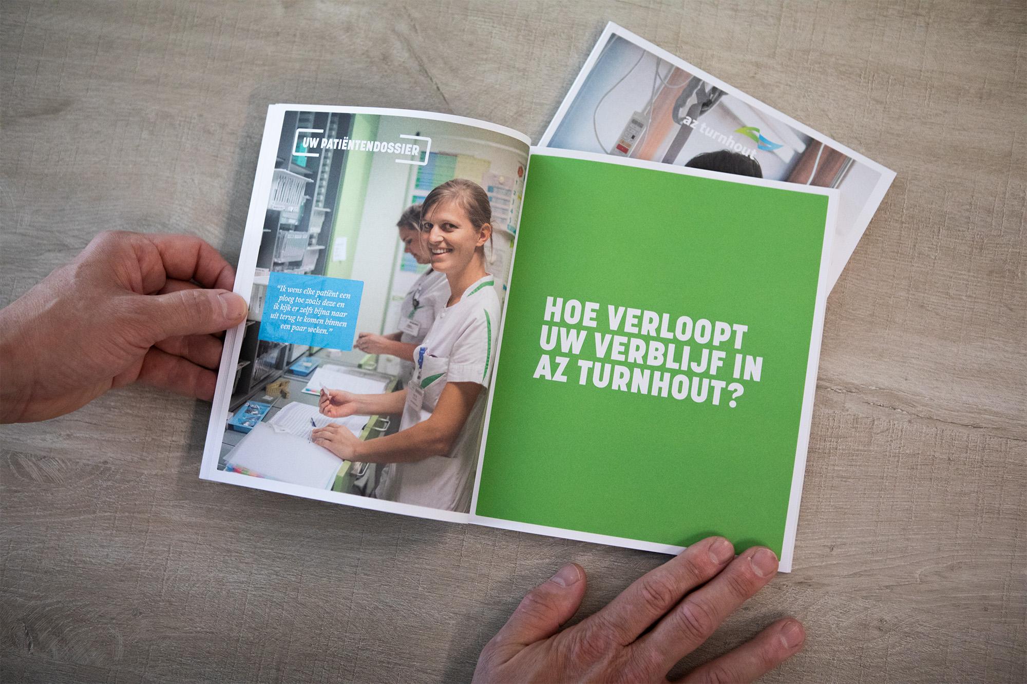
The brochure makes good use of the colour scheme that is part of AZ Turnhout’s corporate identity. From fresh green and clear blue to vivid orange: all the colours complement each other and accentuate the image of a friendly and forward-thinking hospital where patients feel at home.

Appealing infographics
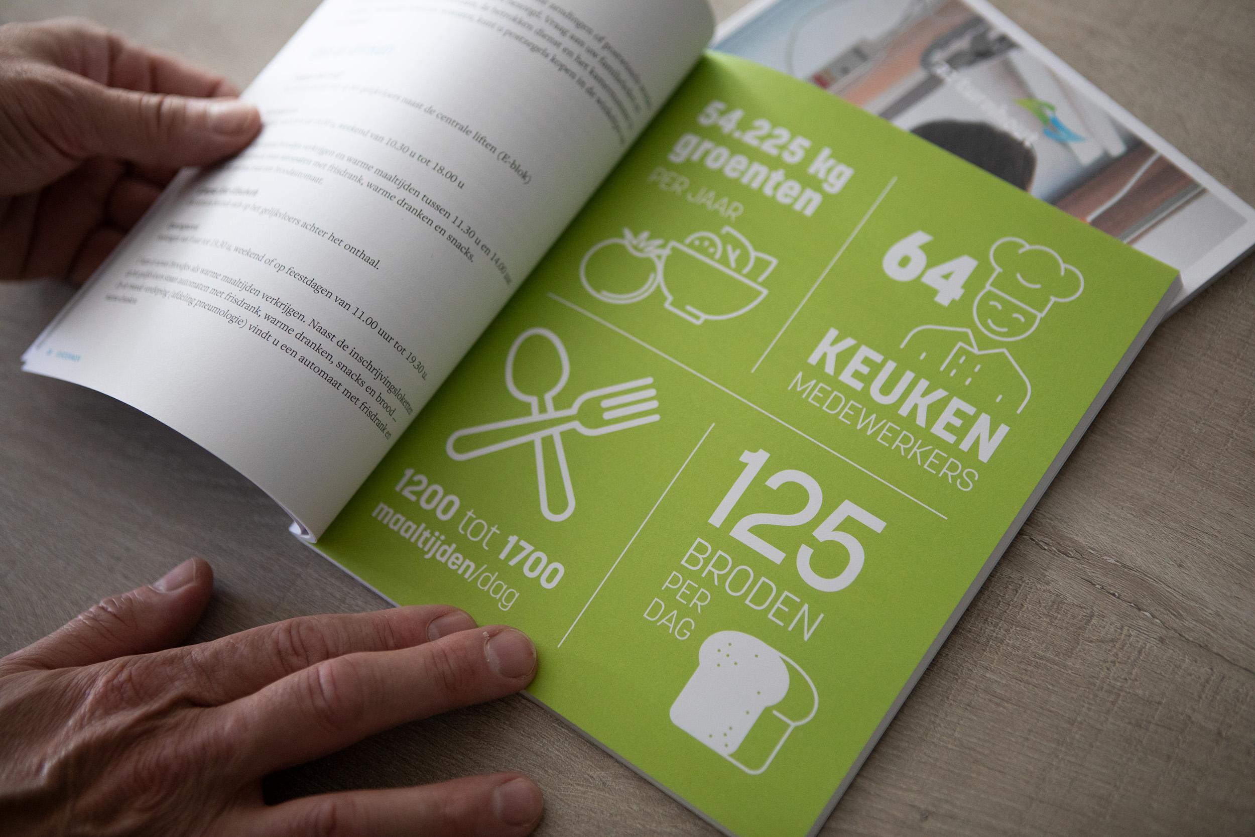
We also created some striking infographics with playful illustrations for the welcome brochure, to make data as accessible for patients as possible.

Handy format
While the common A4 format is not that convenient in a hospital bed, the alternative A5 format turned out to be to small. Therefore, we came up with a custom size for the welcome brochure: 18 x 21 cm. Not only does it ensure that the brochure is easy to read or browse, it also fits in many handbags.
Dedicated logos for every occasion
You can boost the impact of any internal or external campaign with a dedicated logo. AZ Turnhout asked us to design logos for various projects that give them a recognisable identity.
A jubilee is worth celebrating
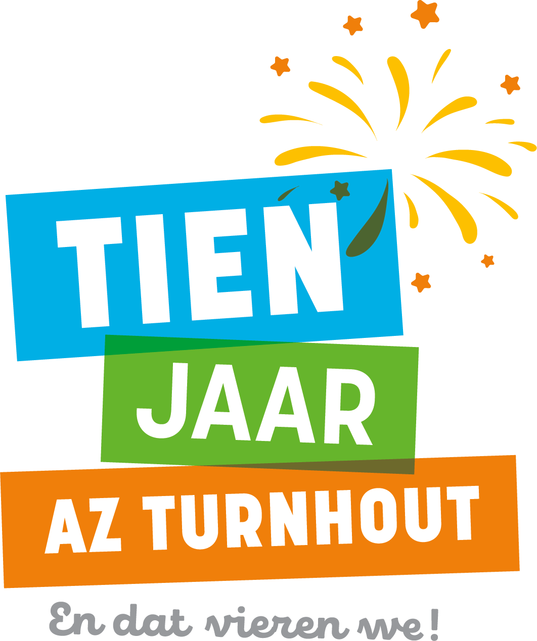
AZ Turnhout is a young hospital with a rich history. Ten years after the fusion of Saint Elisabeth and Saint Joseph and the birth of AZ Turnhout, the anniversary was celebrated with a special programme. Brandle took care of the festive jubilee logo.
Sustained care requires resilience
A lot is asked of healthcare workers. AZ Turnhout is well aware of this and helps its employees to develop and maintain the necessary resilience. Brandle designed the logo for this project.
Working on sustainable care
AZ Turnhout attaches great importance to sustainability. That is why a task force develops specific initiatives to make the daily operation of the hospital even more sustainable, under the motto “Caring for tomorrow”. Brandle took care of the logo design and came up with Bieke, the busy bee.
Practical workbook about breastfeeding
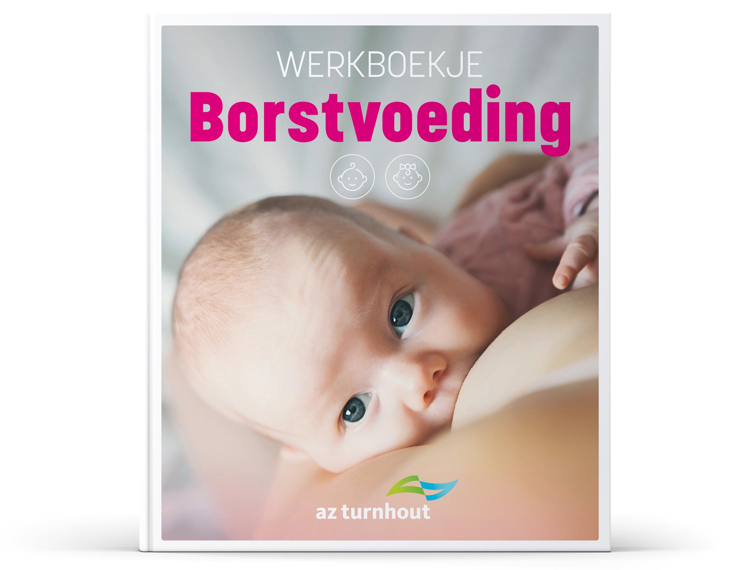
Young mothers need information and good advice. When it comes to caring for their baby, one of the most important topics is breastfeeding. AZ Turnhout asked us to design an easy-to-use workbook that provides practical answers to many questions.
Handy and accessible
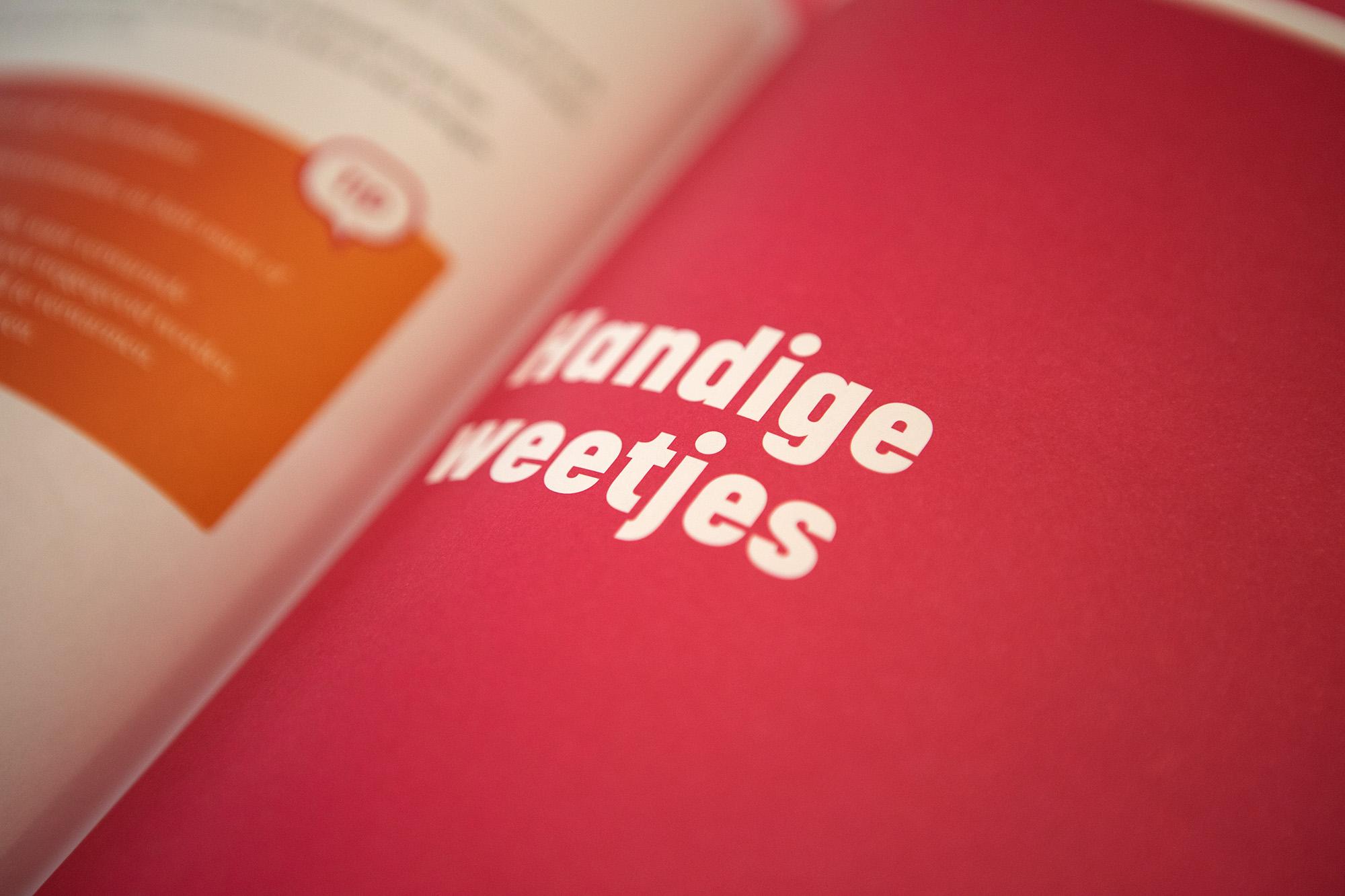
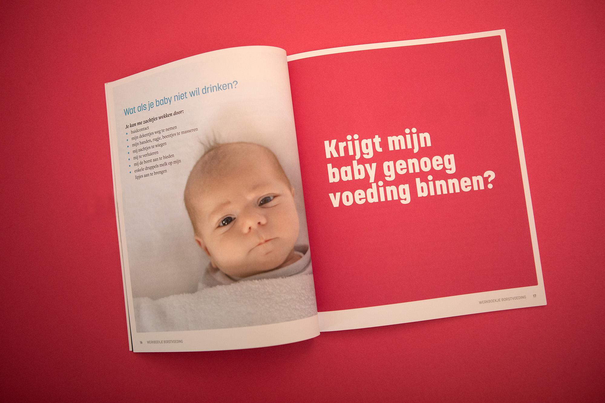
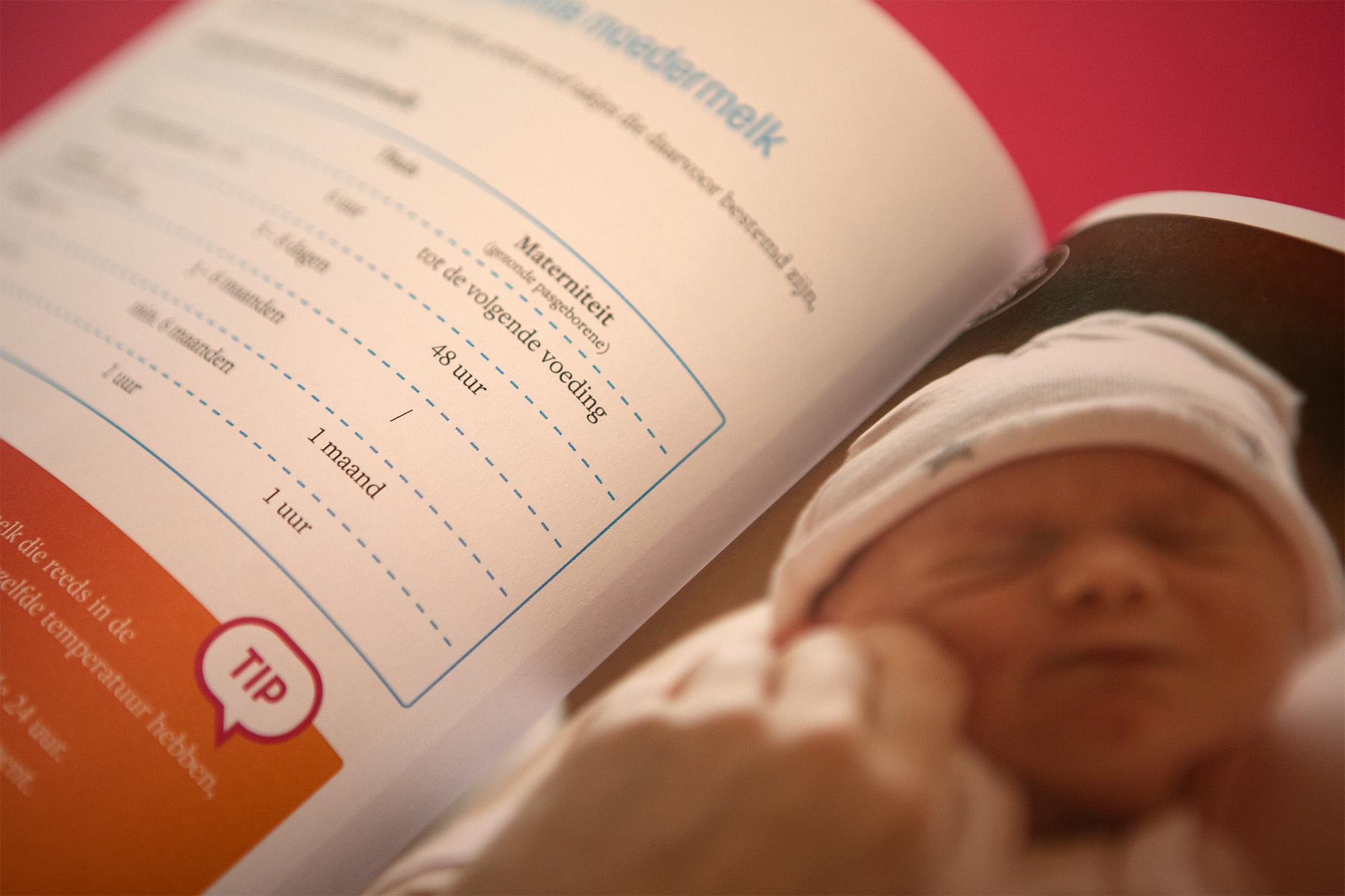
The workbook contains good advice and many tips and diagrams. The clear design and numerous images make the information easily accessible. We gave the booklet the same handy size as the welcome brochure (18 x 21 cm) and opted for recyclable paper that looks good and feels pleasant to the touch.
Clear and practical
Young mothers are often looking for clear answers to concrete questions. The workbook quickly guides them through concise lists, clear diagrams and practical tips.
Get to know us: +32 (0)14 24 26 60
Interesting case? We thought so too. Now here’s the deal. Why don’t you drop us a line? A question would be nice. Or some clever remarks, perhaps?

