Nukamel & Swinco
Nutrition for healthy piglets.
Client
Nukamel & Swinco
Services
Branding, graphic design, packaging
Total piglet rearing concept : advice – milk – feeding system
The collaboration between Nukamel and Swinco arose from the demand in the market for solving specific problems in the farrowing house related to motherless rearing and the increasing number of live-born piglets per sow. The combination of Nukamel's expertise in dairy and nutrition for newborn animals and Swinco's specialism and practical knowledge in the farrowing house has led to the development of a new joint concept.
Capturing the essence
Nukamel’s and Swinco’s goal was to capture the essence of the new concept in a new brand. They called upon Brandle to develop a striking name for the brand and design a stylish brand identity.
Creating all kinds of proposals
Using an online canvas, each member of our creative team was invited to come up with some proposals. This resulted in a longlist of more then 150 possible brand names, all fit to be registered. We then picked the best proposals and clustered them thematically.
Selecting the right name
For each cluster, we selected our top-three brand names and presented them to the client. Following an open-minded discussion with all team members, involving Brandle, Nukamel and Swinco, we all agreed on one brand name as the best and final choice.
Piglait. Surrounded by experts.
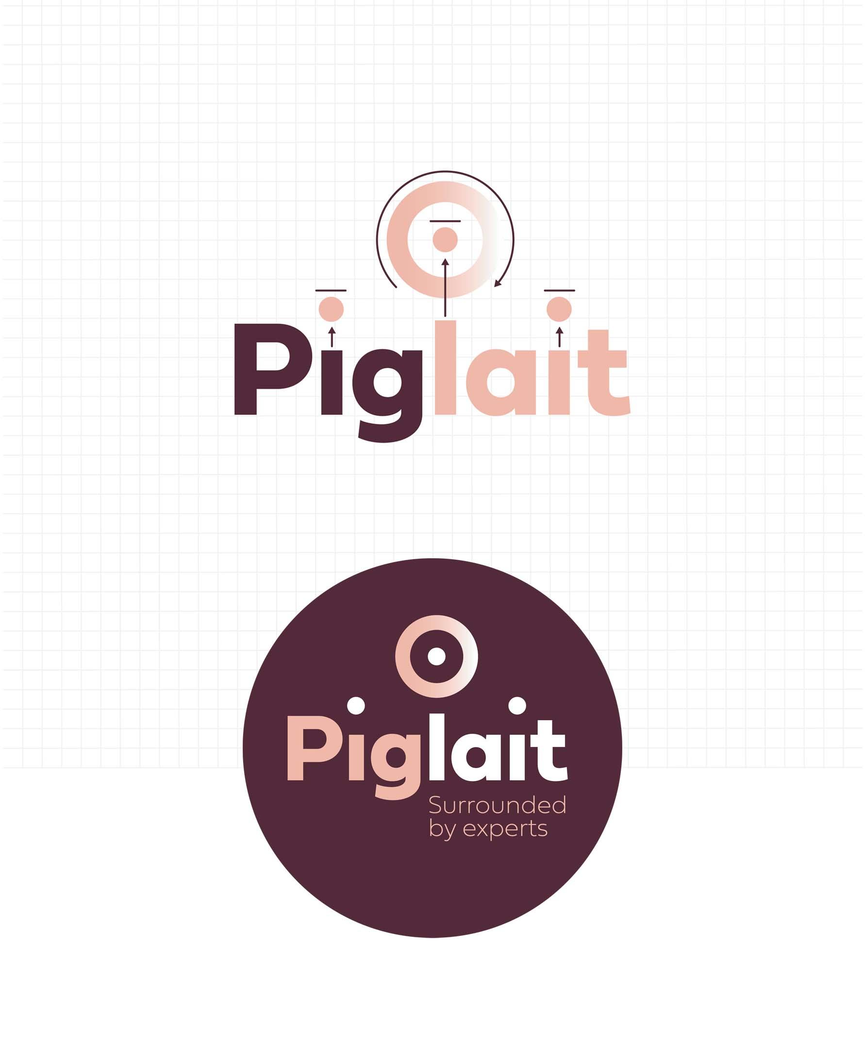
Piglait was the brand name that stuck with all team members as a natural choice. It cleverly combines ‘piglet’ and ‘lait’ into a new brand name. It’s short, slightly quirky and easy to remember. Together with the brand pay-off, it clearly hints at the nature of the new nutritional concept.
Three elements, three dots
Piglait is based on three elements: milk, the product itself, the feed installation and the associated advice. These three elements are represented by three dots, two of which are raised from the two i’s in Piglait. The third dot finds itself at the centre of a circle, representing the feeding cups which are a typical feature of the installation.
A sophisticated colour scheme
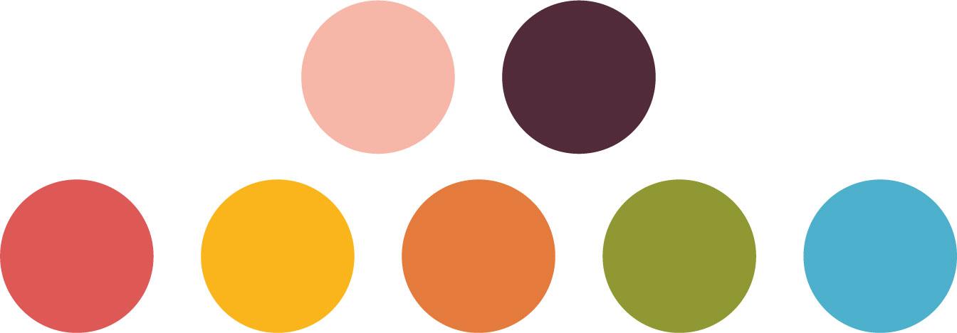
The two main colours, stylish and uncommon in this field, play their part in positioning the brand at the higher segment of the market. The secundary palette, consisting of fresh but slightly subdued colours, helps to add some sparkle where needed.
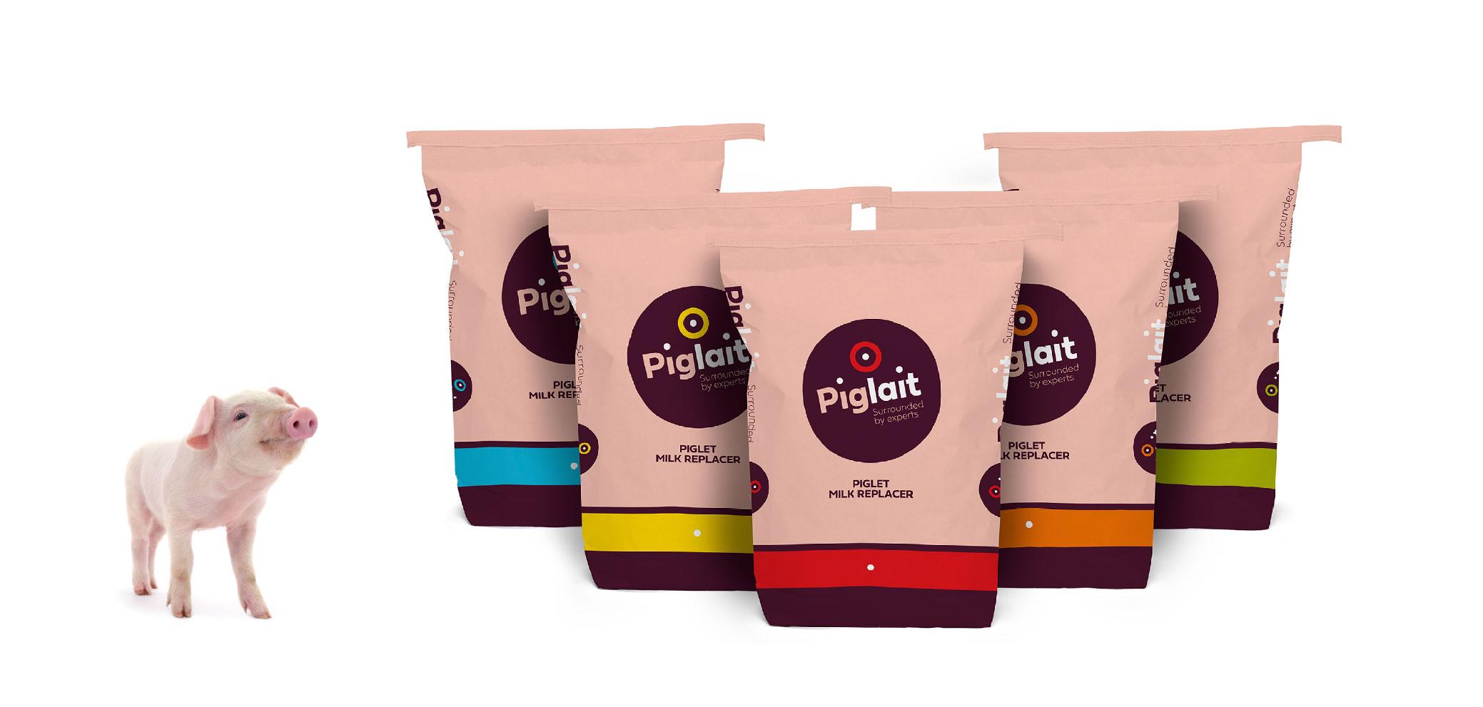
Distinctive packaging
Based on the brand identity we developed, we designed the distinctive product packaging that sets Piglait apart from its competitors.
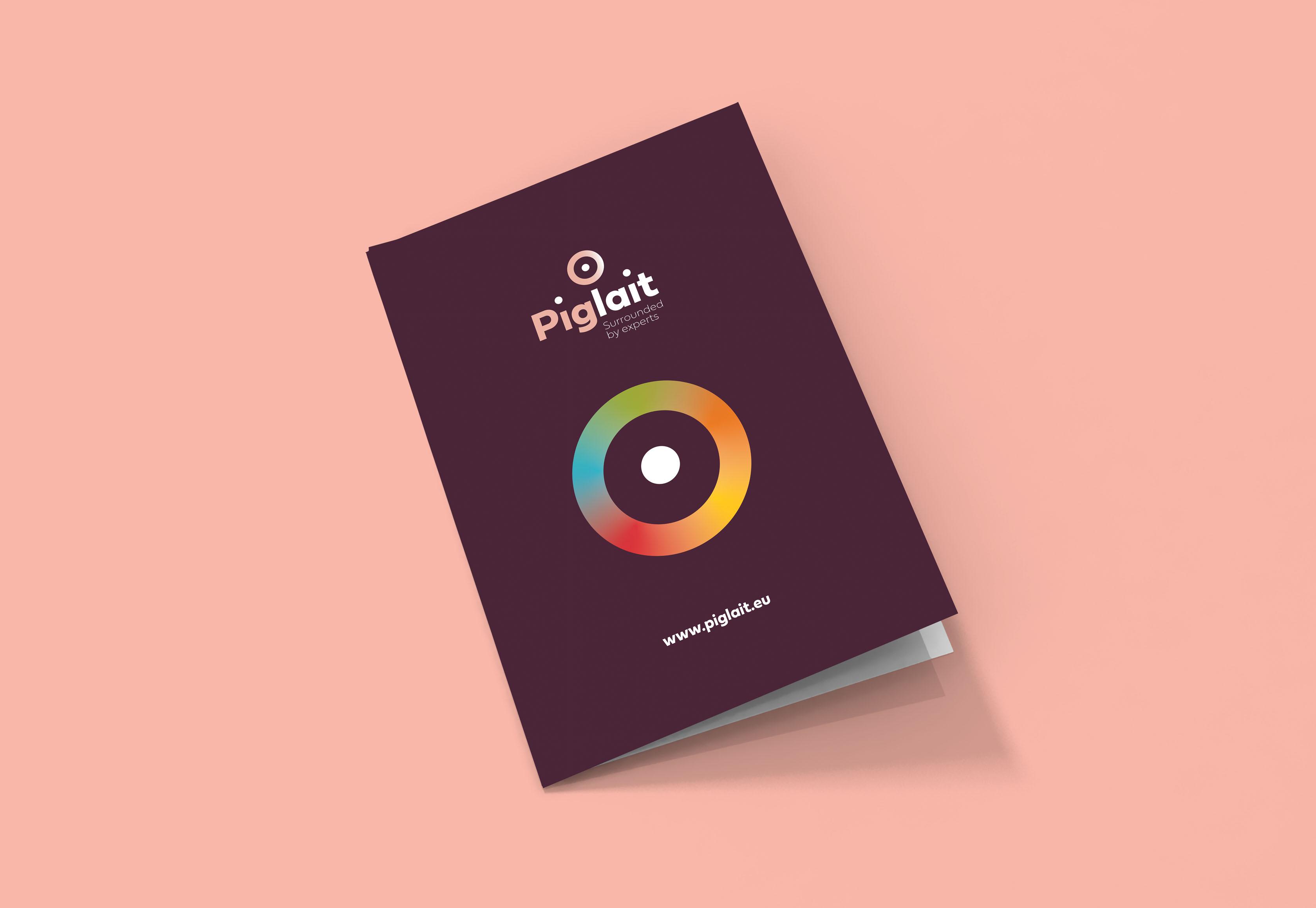
Printed matter
The Piglait brand identity can be experienced in a wide variety of printed materials, where substance and style go hand in hand.

Dedicated icons
We also designed a dedicated icon set, which helps to communicate various elements clearly, directly and consistently.
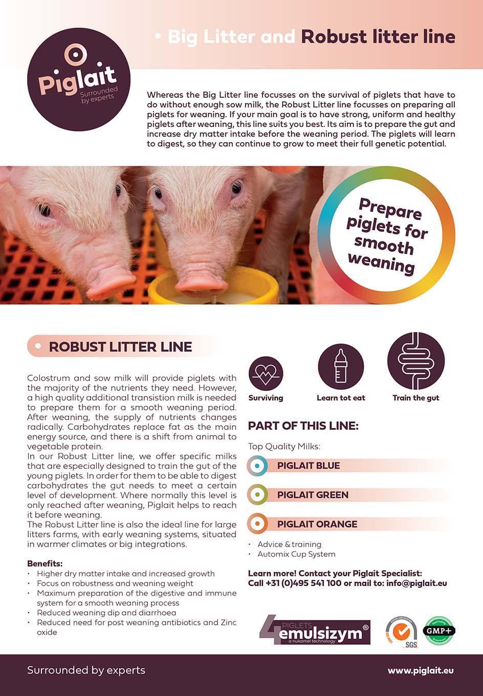
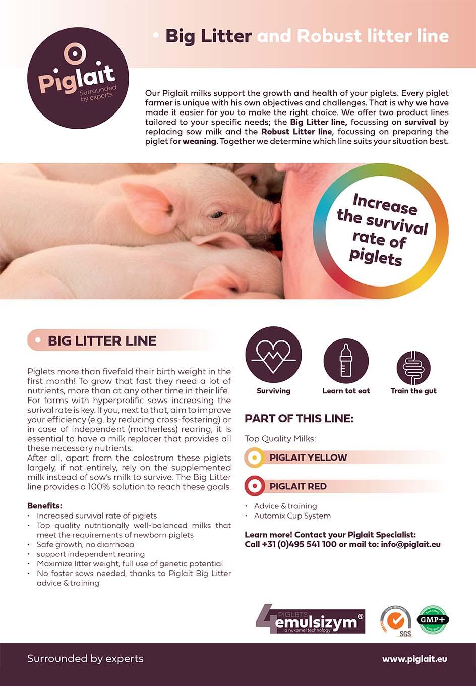
Product info
Carefully designed product sheets present all relevant information in an attractive, concise and easy-to-follow way.
Get to know us: +32 (0)14 24 26 60
Interesting case? We thought so too. Now here’s the deal. Why don’t you drop us a line? A question would be nice. Or some clever remarks, perhaps?


