RDK rebranding
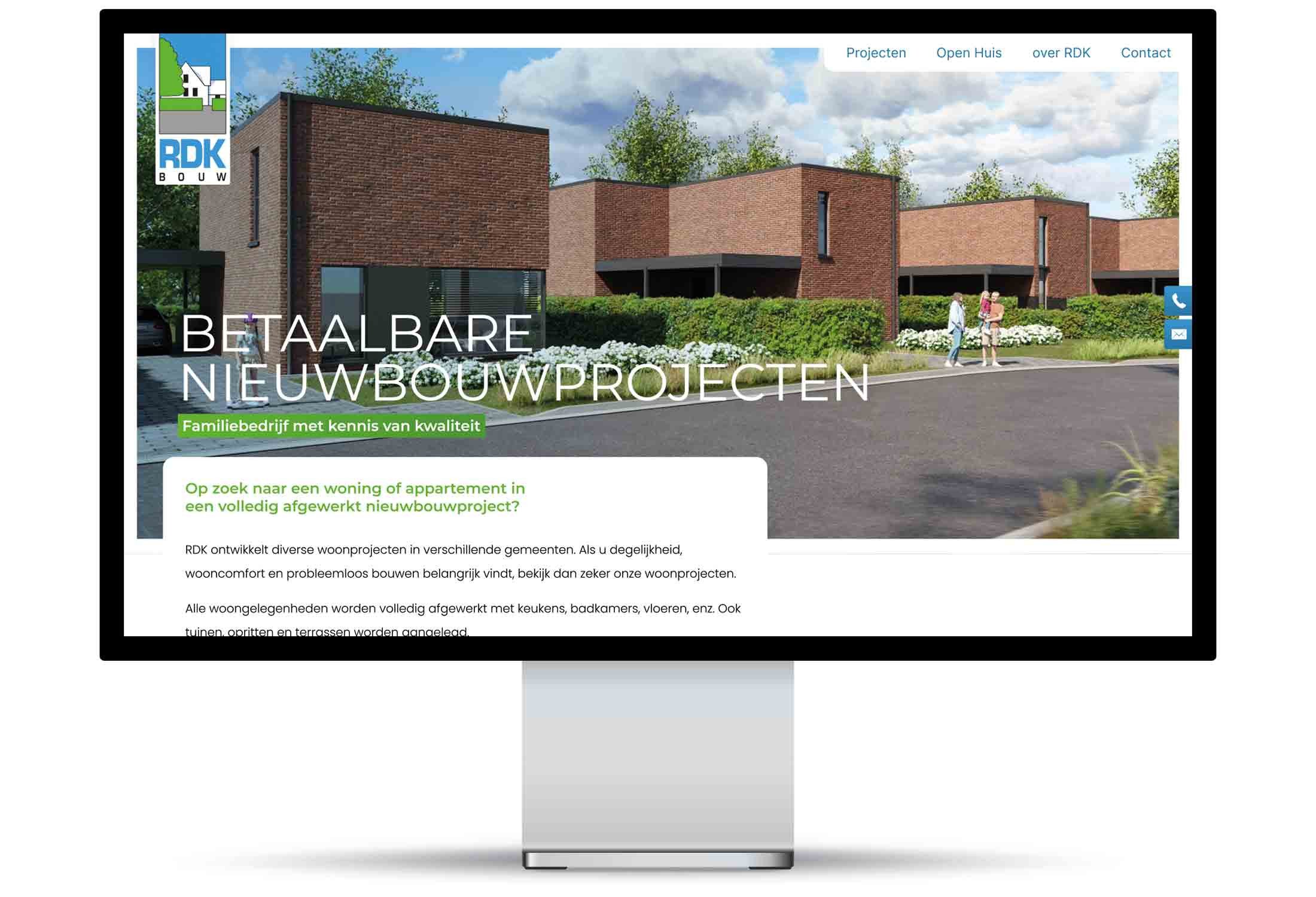
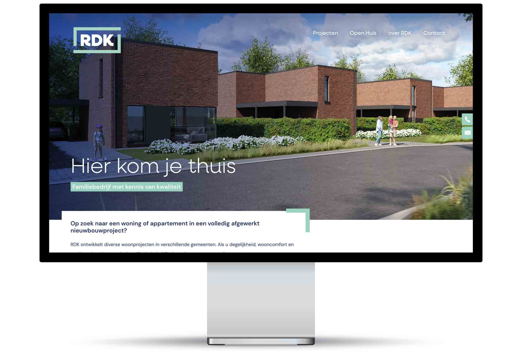
We developed a new corporate identity for RDK and redesigned its website.

Client
RDK
Services
Tried-and-true craftsmanship, a fresh new look
RDK — Rik De Keyser — has been building homes and apartments that stand as solid as a rock for over 50 years. What began as a one-man operation grew into the De Keyser Group, which today employs about 120 people and has dozens of projects in municipalities both within and outside the region. That growth called for a brand that carries as much weight as the company itself. RDK approached Brandle for a new logo and a fresh corporate identity, and immediately commissioned us to bring the website in line with that new narrative.
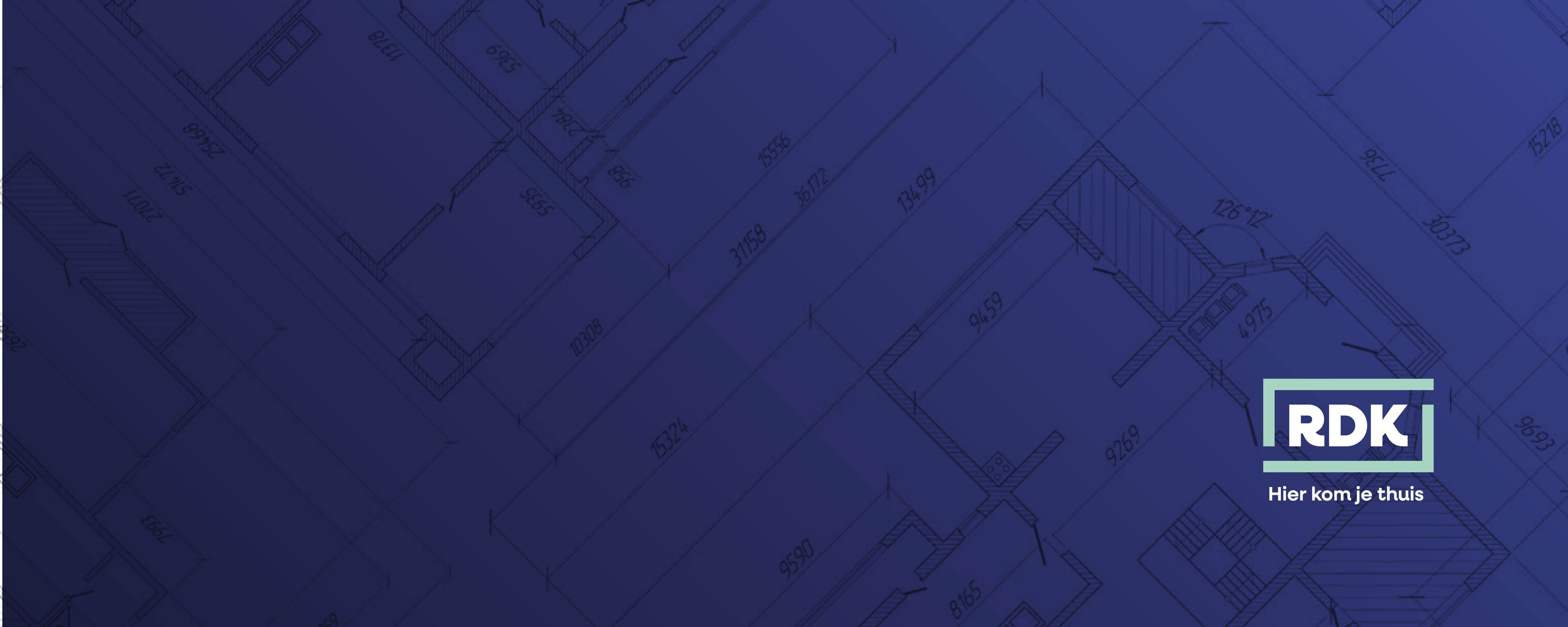
A logo that builds trust
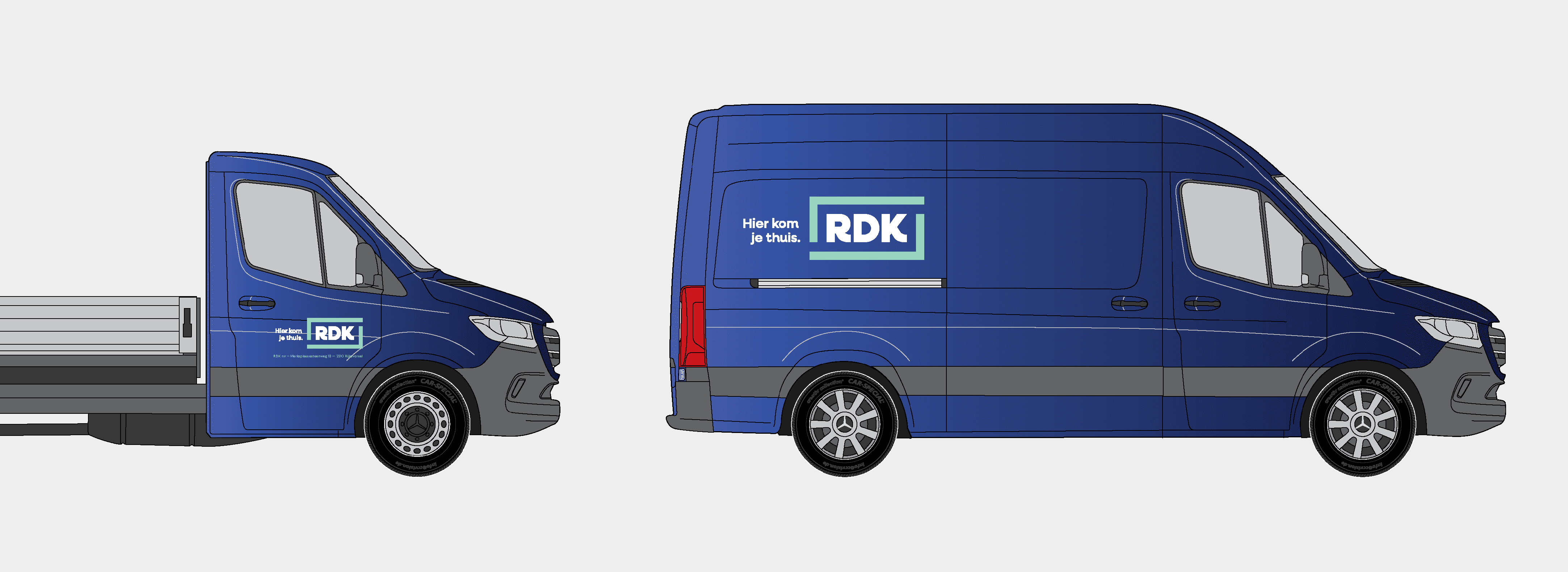
A familiar sight at every construction site and on the road